2018 BuJo Setup

The journal I used for this year’s BuJo is a Rhodia Goalbook. This is my third year in a Rhodia, and if you’ve never used one, you’re in for a treat. The paper is unlike any other I’ve used/felt. It’s called coated vellum, I believe, and it’s so silky smooth. That said, if you like a little grit to your paper, this probably won’t be for you. It also (usually) does very well on bleed through. I say usually because you’ll notice a bit of bleed in my layouts, but that’s because I used watercolors. Standard pens/markers won’t bleed through.

In previous years, I used the webnotebook in a softcover because it came in a variety of colors, and because I use this in a traveler’s notebook. Their standard hardcover was a little too bulky for me when I used it this way. However, there were little things the webnotebook didn’t have that I wished it did, namely numbered pages, an index, and a calendar. Enter the Goalbook! It’s got a total of 6 index pages, a perpetual calendar, a future planning log, and pre-numbered pages. (Click on pictures for links to purchase. You may also find them cheaper than Amazon through other outlets such as JetPens.)
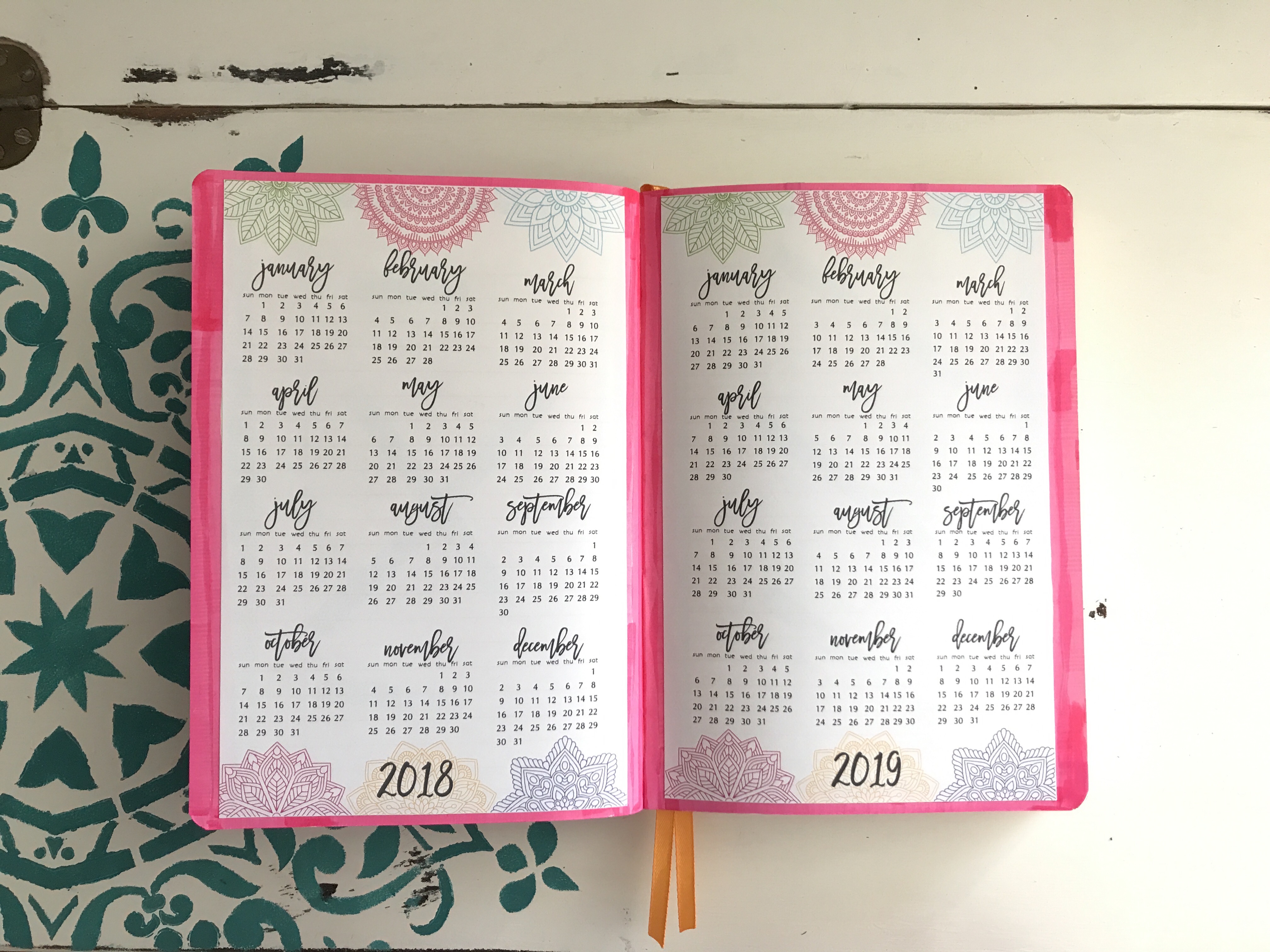
One thing the Goalbook didn’t have was an at-a-glance calendar, but it did have a crapton of index pages. Since I never use that many pages for my index, I just used the last two and created my own at-a-glance calendars. I did this by using printables. I found these somewhere on the lovely interwebs—if you google 2018 at a glance calendar printables, you’ll get a plethora of options to choose from, most of them free. Or you can hop over to the good old Etsy and snag one there.
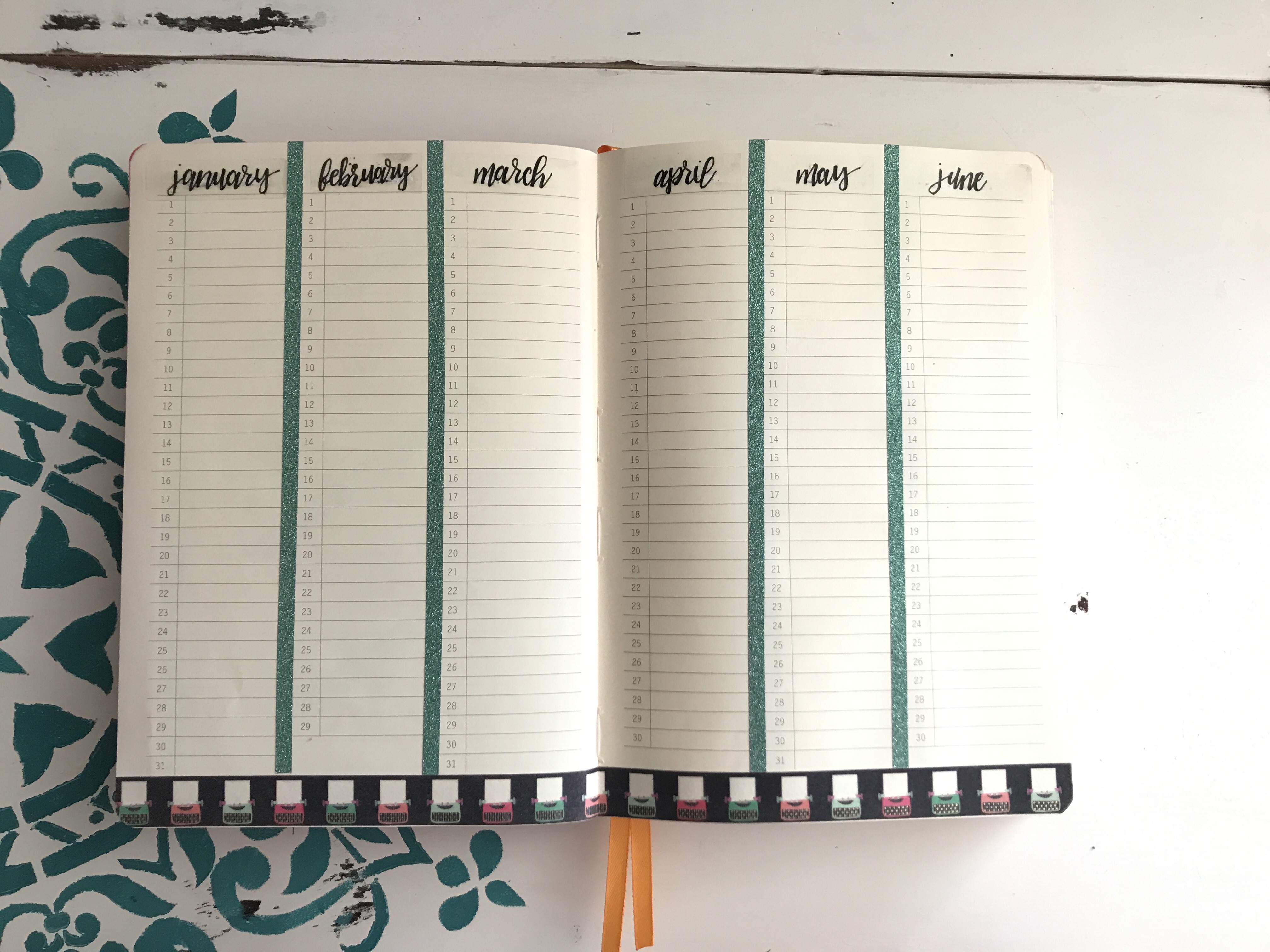
Next up, the perpetual calendar. Since I rarely use the perpetual calendar, I decided to convert mine to a word count tracker. I think it’ll be interesting to see this at the end of the year, and maybe even allow me to see if I have times I take off or need added times to complete a project. I just added some typewriter washi at the bottom and glitter washi to separate the months, though this is already separated with thin gray lines. I also covered up the months at the top and wrote in my own because I’m a font snob and I didn’t like their boring-to-me style. I did this super easy—Uniball Signo white gel pen, clear return address labels, and a Faber-Castell XS Pitt Artist Pen.
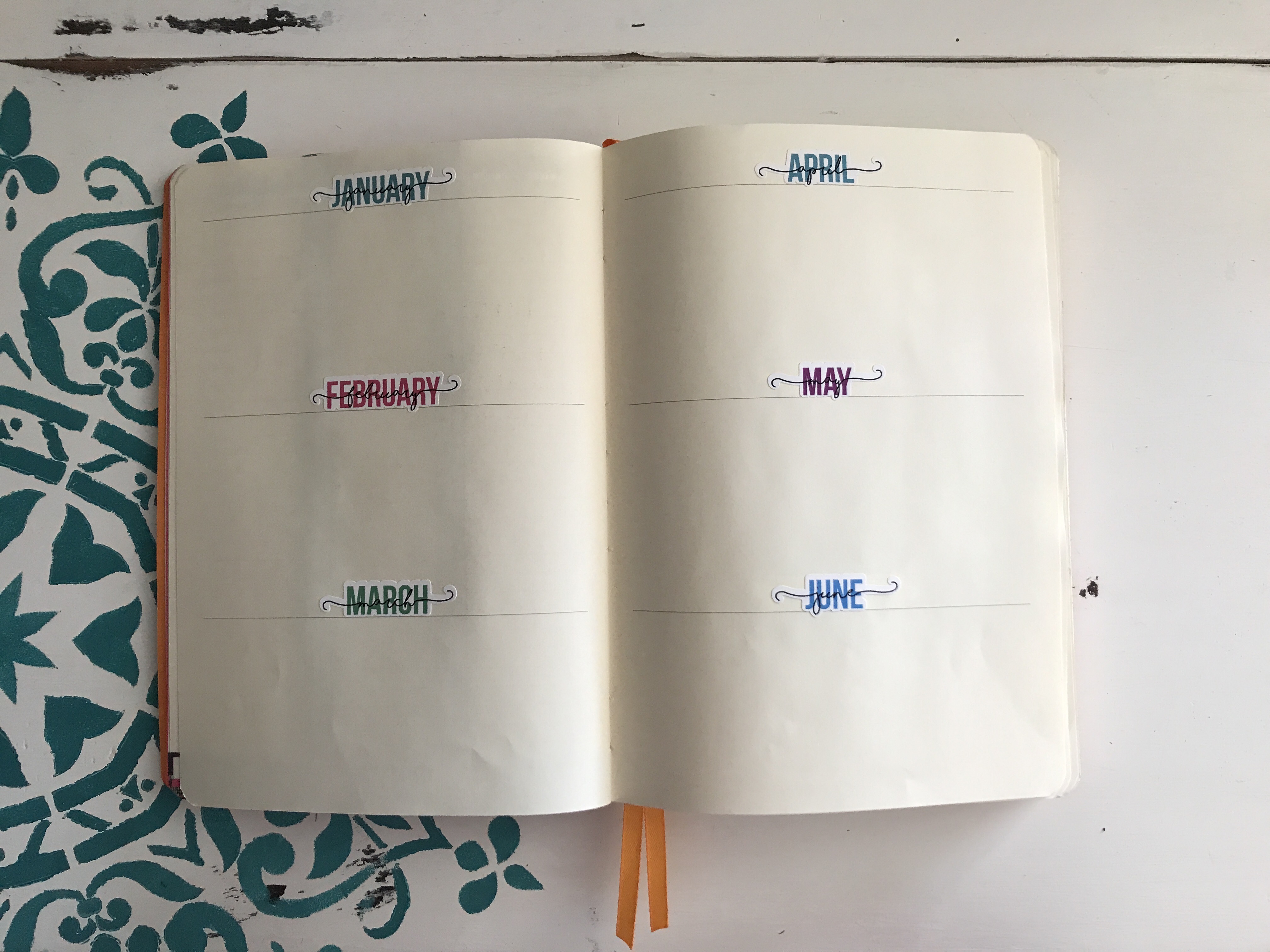
Another already-included section was the future log, or what I assume is supposed to be the future log. I’m not sure yet how I’ll use it—maybe for 2018 goals, maybe big events this year, or I may put my 2019 planning there. Orrrrr, I might split each month down the middle and do both! Ah, the beauty of the BuJo. Not many changes on here, just added some cute monthly stickers to go over their boring-to-me type. Got those on etsy (along with approximately a bajillion more stickers).
Now we’re in the custom spreads. As I was figuring out how I wanted to lay everything out, I wrote down the spreads on post-it notes and stuck them in the planner. Then I flipped through to see if it was a good flow for me. If it wasn’t, I simply moved the post-it notes around. This was so helpful, and definitely something I’ll do next time.
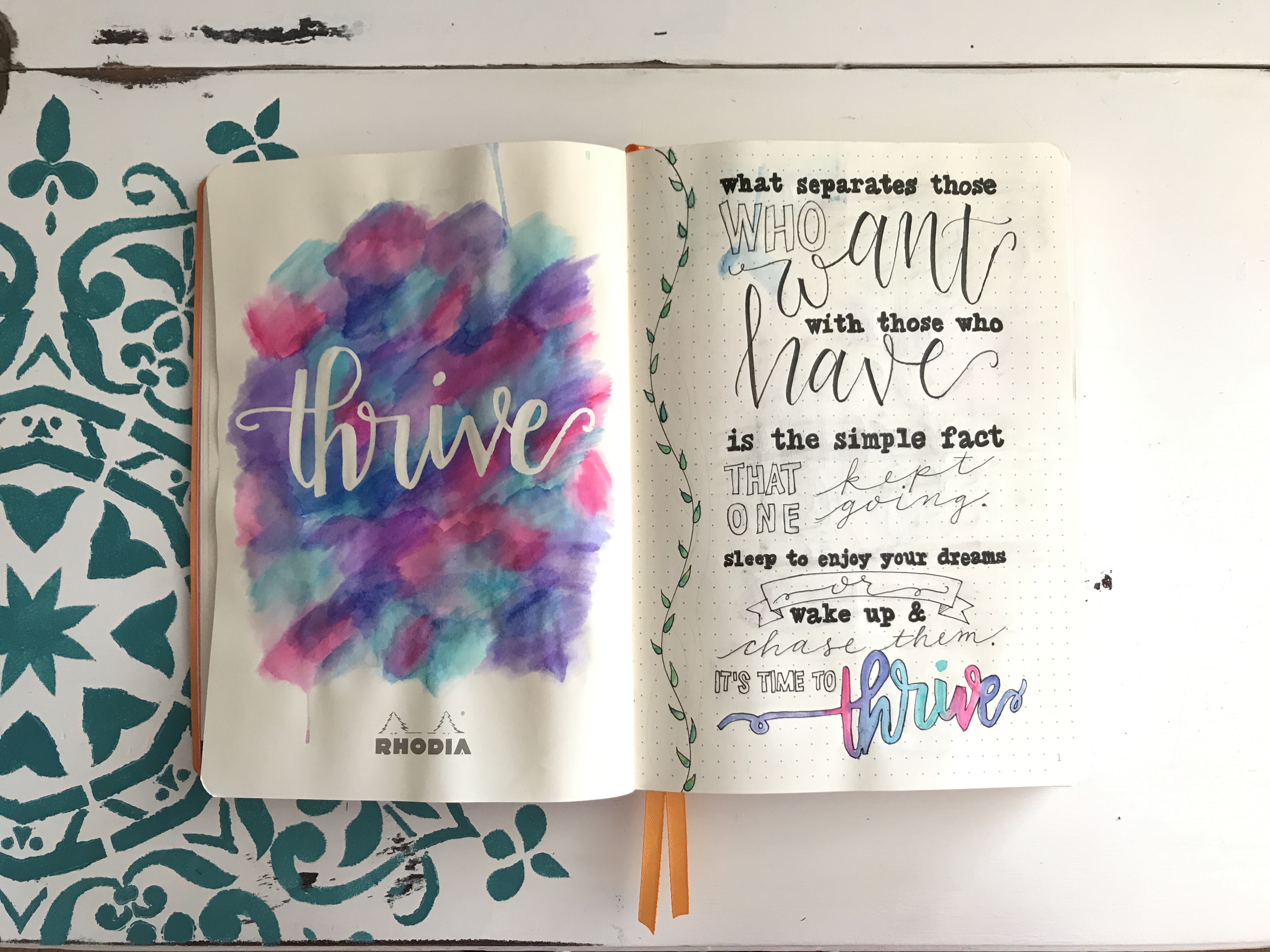
My Word of the Year is THRIVE, and like last year’s spread, I really wanted something that stood out that I could look at through the year and remind me of where I want my head at. I got a little crazy with this spread and tried techniques I hadn’t before, but I really loved how it turned out. On the left, I did a watercolor technique using Tombow Dual Brush Pens, a Pentel water brush pen, a sheet of plastic (I’m too cheap to buy the blending palette, and any bit of plastic will work), and the Molotow masking fluid pen. Something to note: the heavy use of watercolor on the left warped the page. If I had to do this over, I probably would’ve done the water color on a separate page and pasted it into the journal to avoid this. Ah, well. On the right side, I designed a page in Photoshop using different fonts, with the exception of the script fonts. Then I traced the fonts, adding my own script. For the tracing, I did it first in pencil, then went over that with my trusty Faber-Castell. I did the brush lettering script with a Tombow Fudenosuke Brush Pen.

Next up, the goal spread. On the left, I scrounged up a circle in my house to use to trace (the top of a small jar candle) and freehanded the rest. The right side was traced from an old Inkwell Press mission board I’d saved from 2016. I used Tombow Dual Brush Pens and Mildliners for the color, and—you guessed it—my XS Faber-Castell.
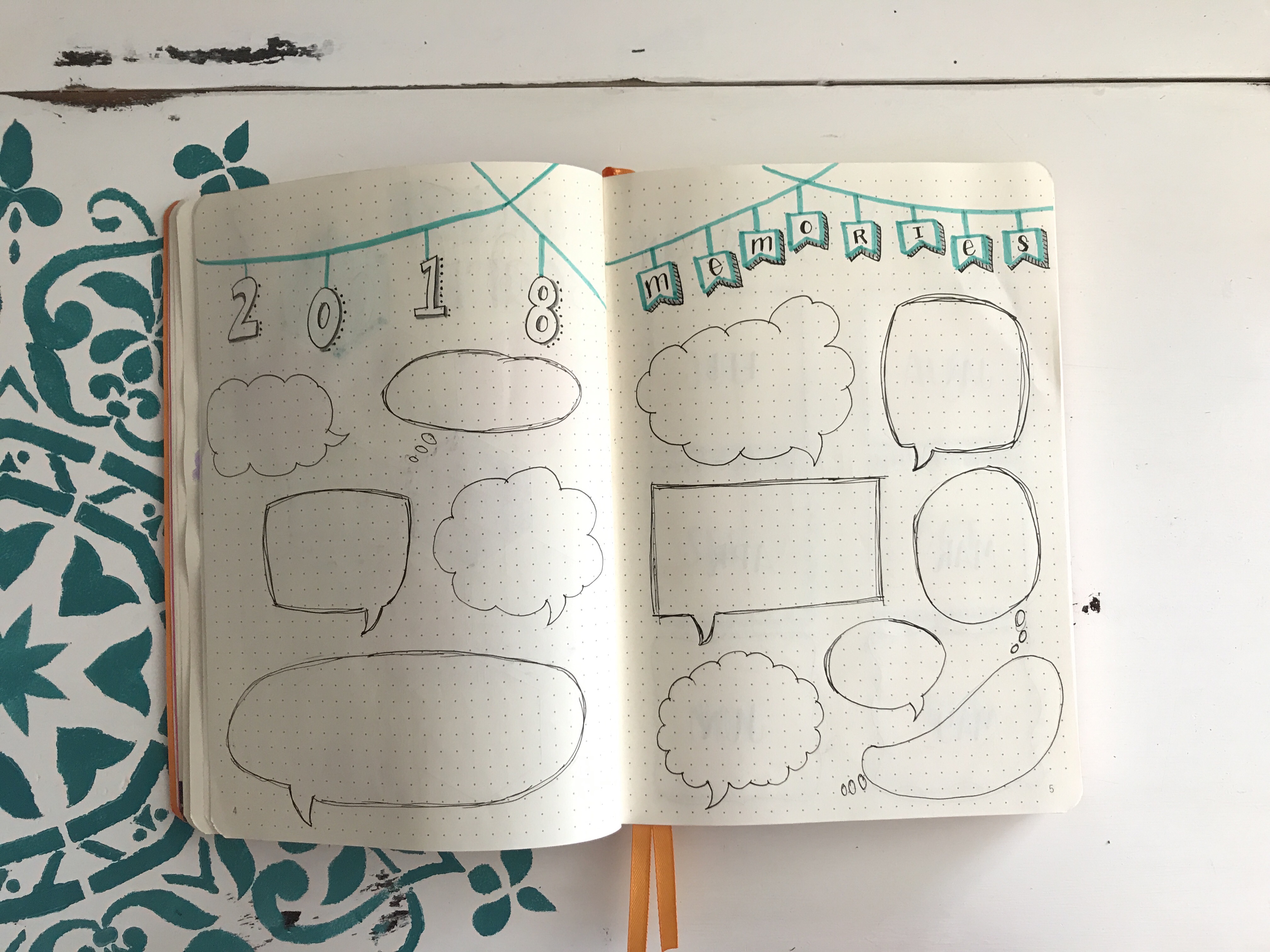
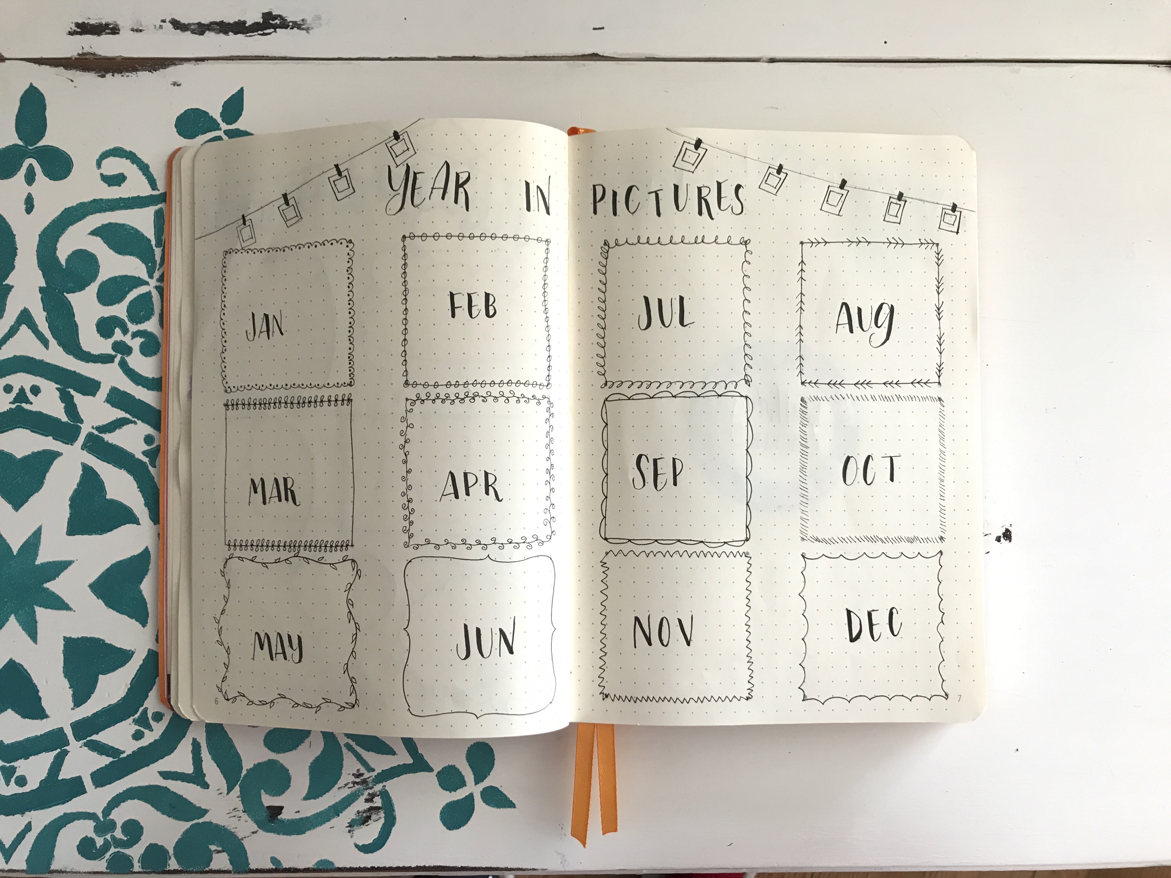
I’m going to use my 2018 Memories spread to jot down any funny/cute things my hellions say and/or any great moments I want to remember. There are always moments I want to remember but never have a place to record them, so I created one. And one of the things I want to get better about is taking pictures. You’d think for being a photographer in my past life that I’d be ahmayyyyzing at this, but I’m actually horrible. And I don’t want to be. So I’m going to pick my favorite pic from each month, print them out, and stick them in. Each of these spreads were created using XS Faber-Castell, Tombow Dual Brushpens, Tombow Fudenosuke Brush Pen, and Mildliners.
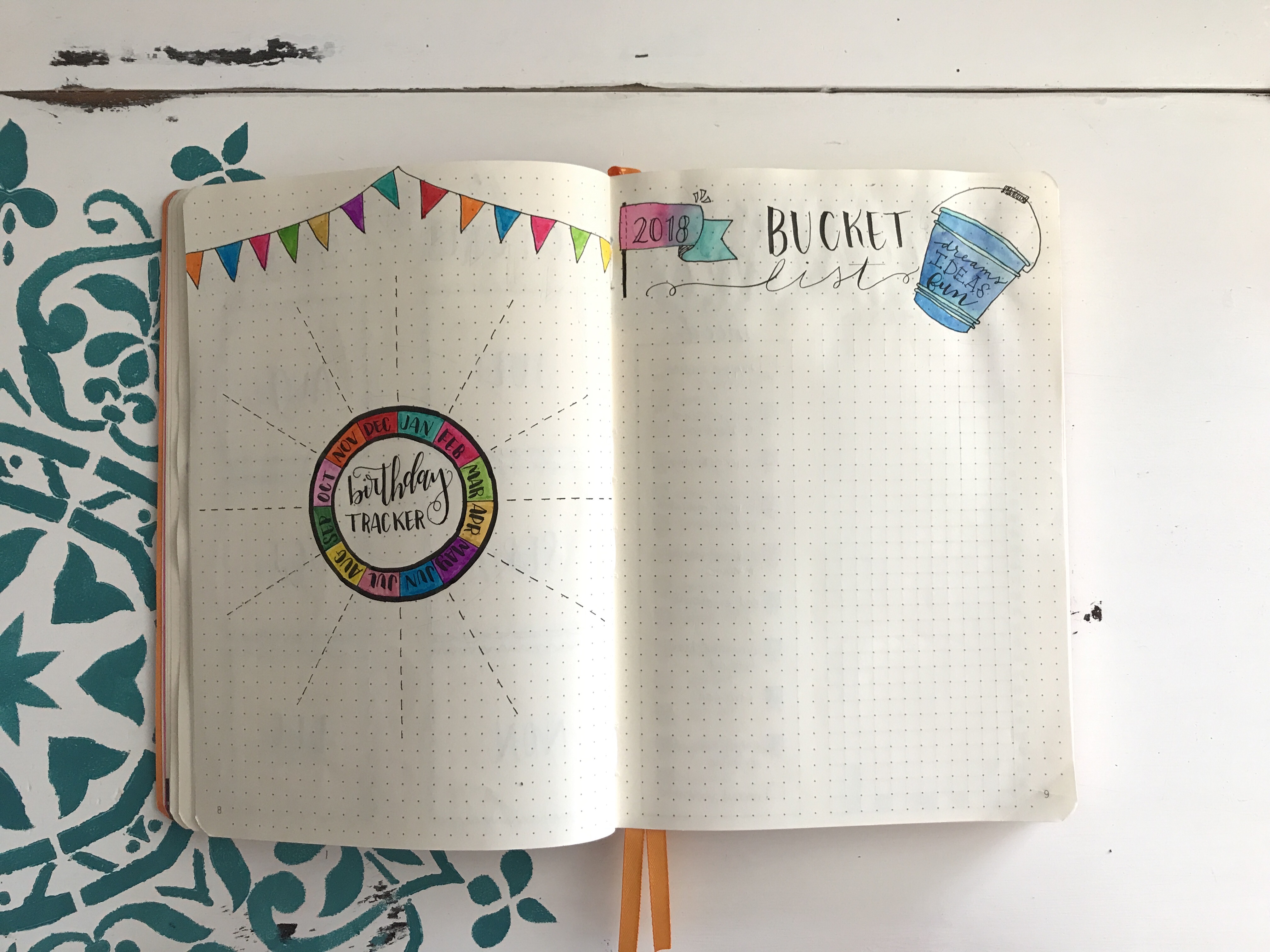
The birthday tracker was created with a milk cap and that jar candle topper because I was too impatient to wait for the stencil I purchased from Hong Kong. But that just goes to show you if you get a little creative, you probably have the shit you need just laying around the house. I don’t plan to use the bucket list in the traditional sense. Instead, I’ll use it to drop anything I want to do/try—new restaurants, movies, shows, books, etc. The left was colored in with Tombow Dual Brush Pens, and the right was watercolored with the Tombows + Pentel water brush pen.
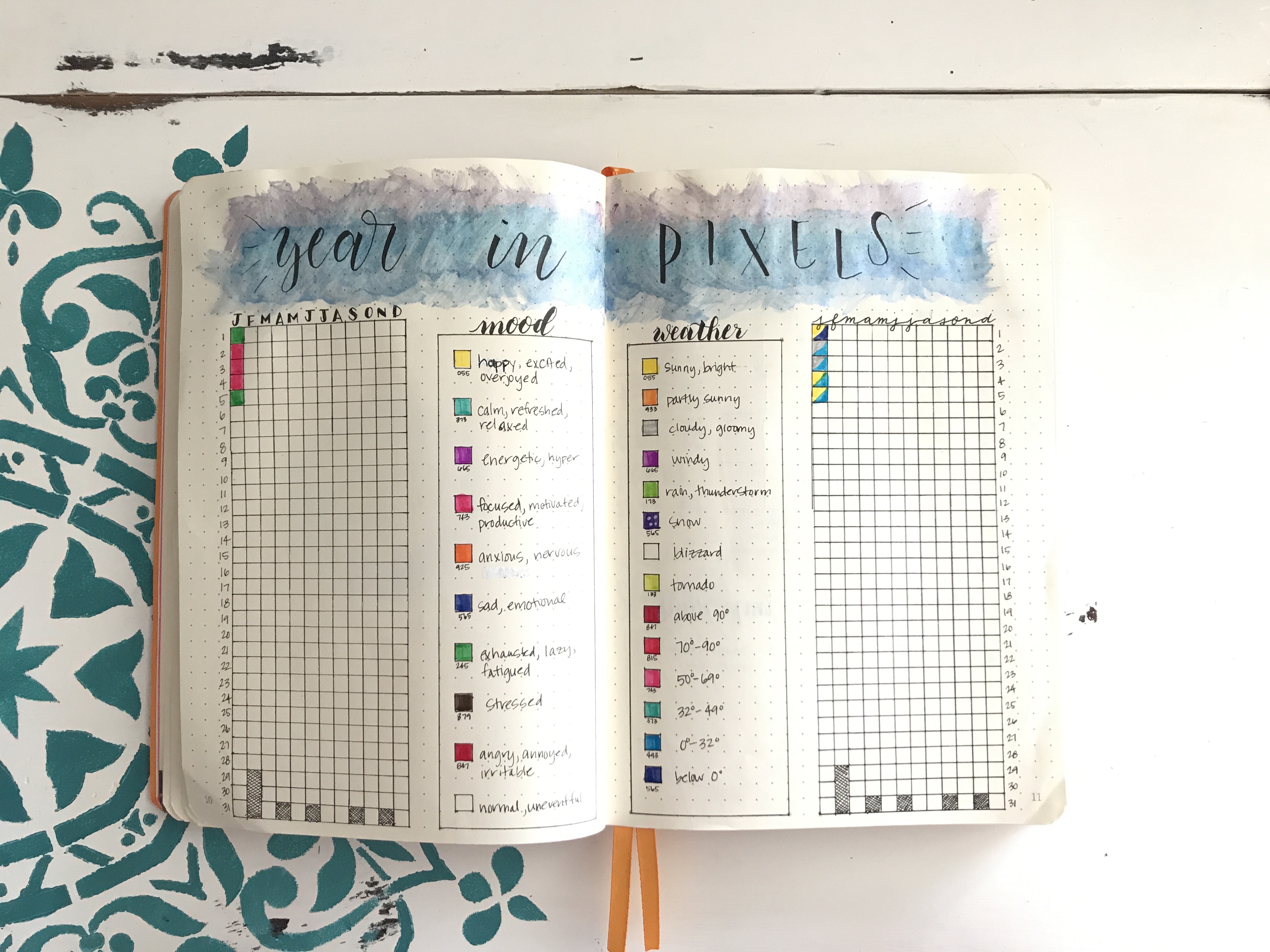
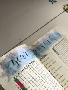
Next up, I’d seen so many people incorporating the Year in Pixels into their journals that I knew I wanted to, as well. Except I added another part to mine—I wanted to see how the weather affected my moods, so I did one tracker for moods, the other for the weather. Weather is split into two by what the weather is like outside (cloudy, sunny, thunderstorms, etc) and what the temperature was. I think it’ll be interesting to see at the end of the year if there’s any correlation to days I’m feeling happy/sad with the weather. Color was filled in using Tombows and Mildliners, and the header was created using some cheap metallic watercolor paints I snagged at Michaels. And, yes, this warped the page on either side. Womp womp. (But, ohhhh shiny!) The lettering was done with the Tombow Fudenosuke Brush Pen, graph and other writing done with the XS Faber-Castel.
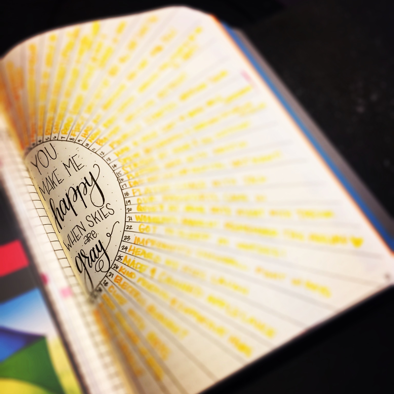
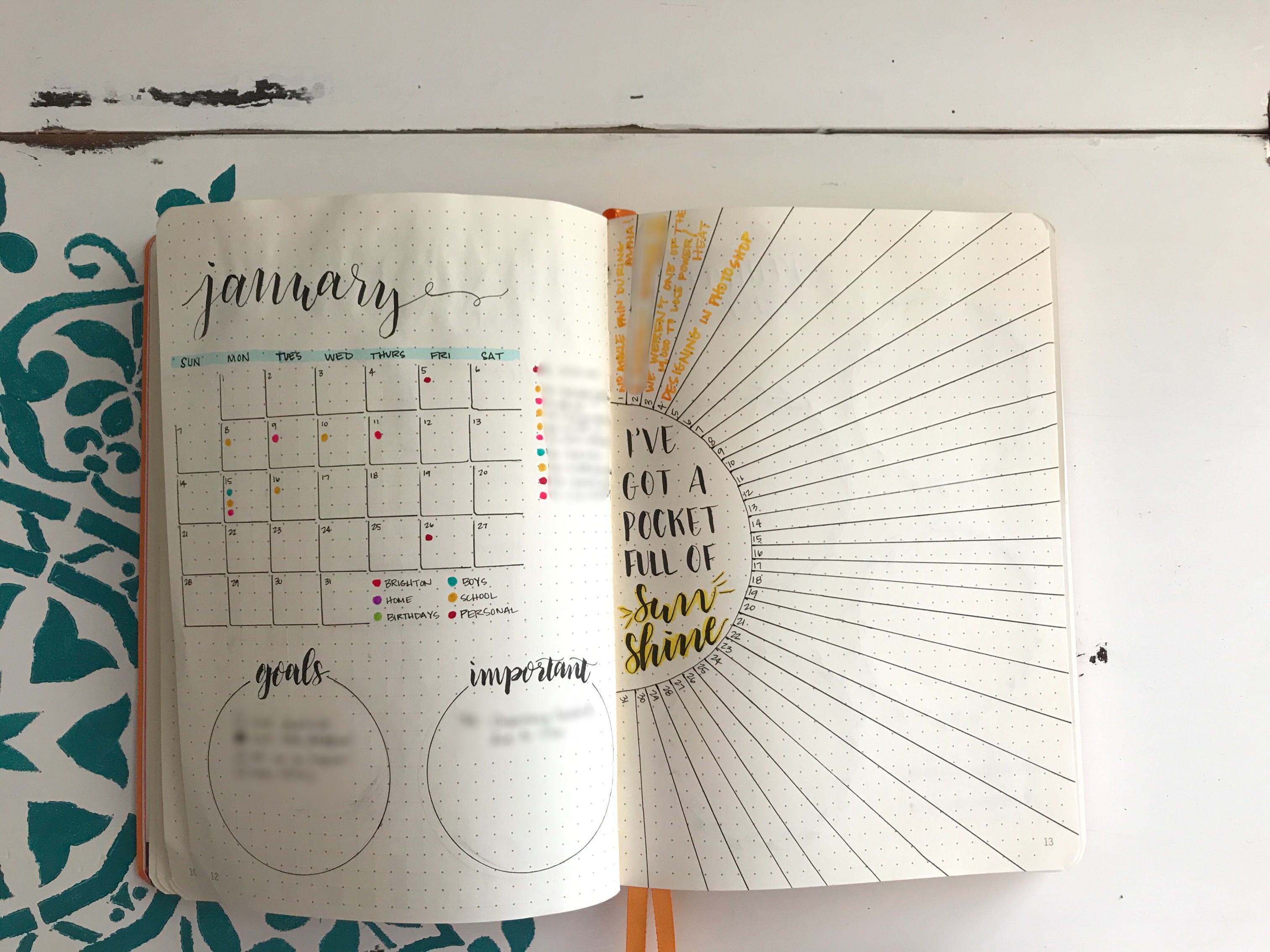
The last spread that I created took me into January. I did an at-a-glance calendar, then used a color coding system to keep track of the appointments. On the bottom, I have goals for the month and anything important I don’t want to get lost in the shuffle. On the right is one of my absolute favorite spreads I did last year. When it’s all filled in, it looks like the sun! This effect was done blending a yellow and orange Tombow Dual Brush pens (scribble out the orange on the piece of plastic, then dip your thin side yellow into the orange and write, then repeat as needed). Small print was done with the XS Faber-Castell and the brush lettering was done using the Tombow Fudenosuke Brush Pen. Here’s a filled in one from last year. *heart eyes*
That’s it! I really love how my journal turned out this year, and I had so much fun creating it. If you have questions about anything I used that I didn’t answer here, ask away!
*affiliate codes have been used for some items in this post. This doesn’t affect the costs of your purchases at all, but it gives me a couple pennies for referring you. And, really, everyone can use some extra pennies.